Release 12.3.2
Customize Menu Options in Guest Self Service for Guest Display
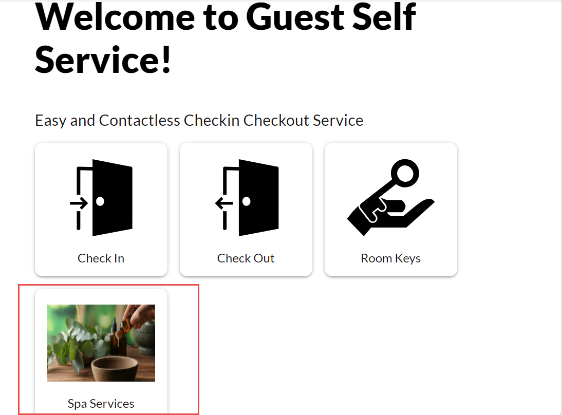
Stay is enhanced to allow users to configure customized menu options in the Guest Self Service Setup screen. The options configured by the users will be displayed as buttons to the guests in the Guest Self Service home screen.
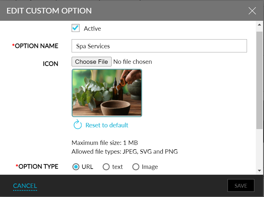
Users can select the following menu option types:
-
Image: Clicking on this button would display an image with the data the property would want the guest to view.
-
URL: Clicking on this button would navigate the guest to a website/web page.
-
Text: Clicking on this button would display information the property would want the guest to view.
When users choose to add more than one menu option, the order in which they must be displayed as buttons in the Guest Self Service home screen can be customized. By default, they are displayed in the order in which they are added and always after the Check In, Check Out, and Book a Reservation menu buttons.
Users can add up to 3 menu options of any option type in the Guest Self Service Setup screen. The total number of menu buttons that can be added to the Guest Self Service home screen is restricted to 6, that is, Check In, Check Out, Book a Reservation, and 3 additional menu options.
To support this feature, the menus, options, and fields have been rearranged and reorganized in the Guest Self Service Setup screen for an improved workflow and user experience.
-
The existing Home Screen tab and the Login tab are moved to a new tab, Home Screen Configuration. It contains the following sections:
-
Home Screen Setup
-
Reservation Search Screen Setup
-
Check In Setup
-
Check Out Setup
-
Room Keys Setup
-
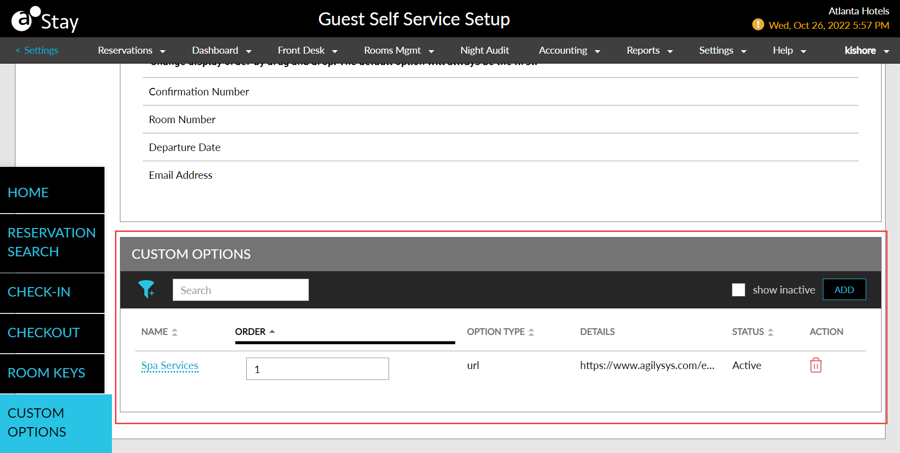
Custom Options
-
-
The following table contains the description of the fields that fall under each of these menus. An asterisk (*) has been added for all the fields/menus/options that are new. The rest of the information remains the same (but may have been moved to different areas in the UI under the Guest Self Service Setup screen).
|
|
|---|---|
|
|
|
|
|
|
|
|
|
|
|
Custom Options (*) |
|
|
|
|
|
|
Option Type (*) |
|
|
|
|
|
|
|
|
|
-
The added options are displayed in the Custom Options section with the following columns:
-
Name - Displays option name.
-
Order - Displays the order of the active custom options. It is disabled for inactive options.
-
Icon - Displays the option icon.
-
Option Type - Displays Option type.
-
Details - Displays URL or Image thumbnail or Text based on the option type selected.
-
Status - Displays the Active/Inactive status of the option.
-
Action - Allows users to delete the option by clicking the delete icon.
-
Show Inactive - When enabled, displays all the inactive custom options.
-
-
The Name, Order, Option Type and Status columns are sortable.
-
Users can search for a custom option using the option name.
-
Users can filter the options based on the option type and status.